
Friday, February 25, 2011
Jenga 3.0 - Jigsaw
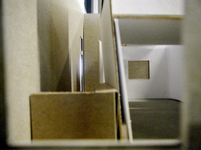
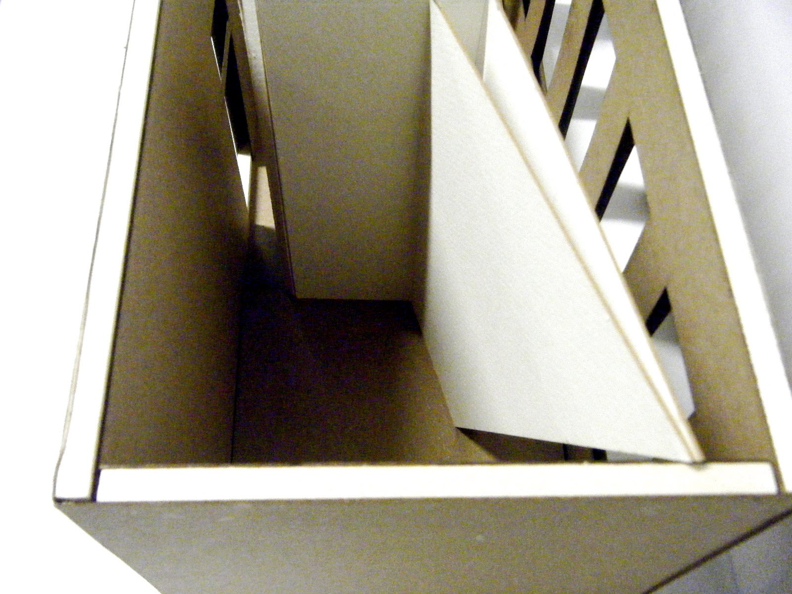
As a group, we noticed that each of our units, based on Spark, Protrude, and Edge possess very distinct, almost chaotic interiors that differ strongly from the bland box of the shell. We also realized that each of our interiors feature a dynamic playfulness and invitation to explore that the shell does not yield. In our attempt to ‘break out’ of the box, we literally strived to emulate this concept that was sparked by our proposal word, Angle. We decided to turn each of our interiors inside out to deconstruct our individual concepts and have them morph into one continuous form that weaved around the units. The beginning of this continuous form starts at a tilt protruding from Anna’s upper story and angles downward through Faith’s upper story.This distinct tilt offers shelter to two public spaces and reflects the encompassing angles within Justin’s interior. As the slant comes to an abrupt halt hovering over Faith’s unit it declines downward at a counter angle position. This new angle has a thicker mass and relates directly to Faith’s solid protrusions within her interior. These angled protrusions solidify into the ground plane near the main entrance but reemerge at a precarious triangular tilt a few feet to the left that creates another entrance for the bottom public space. This triangular tilt is met by it’s inverted twin that morphs down into tessellated triangular angles shaping a residential garden.These angles shift around Justin’s unit and imitate the dynamic slants moving behind closed walls. As the angles move further out as if yearning to escape the impenetrable linearism of the exterior shells they are betrayed and reeled back in by more angles that wander forcefully upward to support a balcony that wraps around all the units. Yet even the balcony provokes mischief as it distorts into angled ramps around the edges of each unit, and as it passes by Anna’s unit the balcony sinks and protrudes according to the level changes hidden behind her walls. The balcony comes to an end back where it started, at the massive ceiling tilt, opening up to a public café and a declining stairway leading out into the world.


Friday, February 11, 2011
Jenga 2.0 Reflection
If I have learned anything from the 2nd phase of this project it is that I need to work on compositional integrity and flow. Coming into this semester, I have realized my close attachment to hand rendering and technical drawing, a quality I never would have guessed, entering the major, would be more important to me than computer aided design; there seems to be something more personal and intimate about it that I have grown accustomed to. On that note, my focus has been on the spatial layout and crafted quality of the project, while creating a crisp layout has been put on the back burner and this is, in part, due to hand rendering because it takes more effort to scan in everything and create a composition as opposed to everything already preexisting on a computer. My efforts as I enter the next phase of this team project is to combine our strengths and get more comfortable with the computer aspects of design that I could truly benefit from and grow as a designer. I also tried to choose my team members with careful selection. Anna has experience in Auto CAD and utilizing the wood shop for model building that I would prefer over chipboard models primarily cut at CAM Studio. Faith has experience with Auto CAD and Podium rendering for perspectives as well as excellent color and placement judgment represented in her diagrams. I have a focus on hand rendering and meticulous study of space as well as work in CAM Studio so we can be efficient and proficient in both CAM and the woodshop. On a final note, through observing everyone else’s work, I witnessed the same issues with compositional layout but I feel I am a step behind simply because hand rendering has more restrictions and hurtles to cross to create an organized board and that is what I plan to improve on in the next phase of this Jenga project.
Jenga 2.0.
A Spark can be thought of as a fresh and spontaneous occurrence, and therefore can be seen as raw and inspirational. It can take on a figurative meaning, or physical form, and in this space I attempted to merge the metaphysical rawness of a spark with the physical crudeness of select materiality.A rusted metal veneer, coarse wire mesh, slanting metallic slabs joining at clashing angles, rough paneled railing, cold concrete flooring, and Indian red/Terracotta carpeting are but a few of the ominous but playful features explored within this space.
There is a sharp contrast in the design of the first and second level in order to provide both the sense of comfort and unease that a spark can initiate. The first level is foreboding and boldly rough but the more intimate areas of the loft and lower level provide more of a sense of warmth and comfort through material choices like plaster walls and warm coated surfaces.
The design is initially meant to shock the viewer and provide a sense of the primitive side of a spark, but as you circulate through the space to smaller nodes the spaces become more inviting and provide the undertone of the warmth and comfort of a spark.

Loft Plan

Main Plan


Tuesday, February 1, 2011
28+31 : Audra Volpi
Audra’s concept word was beehive and she too chose three sub concept words to base her designs on as a reference to the main theme.
Her 11’x 32’4” space was developed from the idea of a system of networks, much like a honeycomb system for a beehive. She represented this idea through two solids that created multiple modular units throughout the space via several built-in components and a series of pocket doors that divvied up the space for different functional purposes. I think that the combination of her plan drawing, which gave an overall sense of the space in all its complexity with the further analysis of the ‘parts to the whole’ provided in her sections really helped clarify her concept for this space.
The 22’x22’ space was based off the idea of pollonization and a sense of movement pertaining to the flight of bees. She utilized two curvilinear, flowing walls that connected at the ends as a reflection of the flight path of bees with a column rooted between the connection of these two walls to resemble the stability of the bee’s network. There is no doubt in my mind that Audra’s plan is most descriptive of her idea as this was the only drawing I focused on during her presentation of this one space.
Audra’s 32’4”x11’ space is inspired by the beehive hairstyle of the mid 20th century. She utilized two massive columns two act as a monolithic supporting device and to obscure the view of the staircase whose swoop resembles the appearance of the beehive hairstyle, while the wall is a bit isolated and arbitrary in the corner, acting as a private screen for the bathroom. The plan for this space is a bit bland, but the sections really help articulate and bring interest to the space.
Overall, Audra is a very down to earth, mellow presenter that gives her an aura of confidence in her style and work that I appreciate. She maintains focus on both her project but also on the people she is presenting to, which is a very admirable quality.

28+31 : Anna Bernhardt
Anna’s concept word was Edge and she decided to subdivide each of her spaces into separate themes that stemmed from the main word Edge, consisting of On the Edge, In the Edge, and Over the Edge.
On the edge, as I understood it, is based off the idea of being on the edge of your seat and having to explore each border and turn as it offers a new and refreshing surprise. I thought her explanation of the entre way was most successful in theory and execution because walking through the entrance your are immediately closed off by two solids on either side and are forced to follow them until they meet the edge where you are greeted by two directional pulls to the left and right. These solids acted as a claustrophobic plane until you met these clarifying edges.
In the edge focuses on being contained within some variety of an edge no matter where you occupy the space due to the chaotic array of level changes on the floor and overhead beam joinery between the two columns and wall. This sense of being ‘contained’ is also generated in the entrance where you open the door and you are immediately greeted by the edge of a wall. I think above all else, Anna does an outstanding job initiating her concepts from her entrances that then lead you through the entire space.
Over the edge takes on a more surreal approach where she utilizes two angled walls growing from shorter to larger from her entrance that creates a focal point around an abstracted tree (column) lying at the opposite end of the room. These flayed planes and edges reflect her ‘over the top’ concept and the use of two tubs where water flows over into the next carries this idea not only to her structure but to the function as well.
Anna has a great ability to orate her ideas while also maintaining eye contact with those around her. She articulates her words, speaks audibly yet smoothly, and has a calm persona that makes her speech all the more believable and convincing. Overall, I think that Anna’s floor plans show the most spatial details of her ideas because it is easier and more viable to visualize her concepts when I see the space as a whole and not in the detached sections and ceiling plans. However, drawings aside, I believe that Anna as put her best effort into the models that truly show creativity and solidify the space beyond her words.


Subscribe to:
Comments (Atom)
